Default Tab for GridGain 9 Clusters
In addition to the My Cluster tab, the Dashboard screen contains a default dashboard (the Default tab) that provides metrics for and essential information about the GridGain 9 cluster.
You can modify the contents and appearance of the Default dashboard, as well as add more dashboards (as new tabs on the screen).
To be monitored, GridGain 9 clusters need to export metrics. To enable the metric exporter, click the Update configuration button in any of the initially empty widgets.
In some environments, Nebula’s auto-configuration of the exporter might not work. To resolve this, use the GridGain CLI to modify the cluster configuration as follows:
cluster config update "ignite.metrics.exporters=[{\"compression\":\"none\",\"endpoint\":\"{connector_address}\",\"exporterName\":\"otlp\",\"headers\":[],\"name\":\"cc_exporter\",\"period\":5000,\"protocol\":\"http/protobuf\"}]"-
If you are using a custom connector for metrics, then in the
endpointfield, enter the connector address that is reachable from the cluster nodes. Its value should matchcc.base-urlas documented in the Cloud Connector section. -
If you prefer to use the embedded connector, then set the
endpointto the Nebula portal address:https://portal.gridgain.com/.
Viewing the Default Tab
The Default tab contains several widgets. A widget is a UI element that provides a visual representation of a set of metrics or provides information about the state of the cluster.
On Default, you can add any number of widgets.
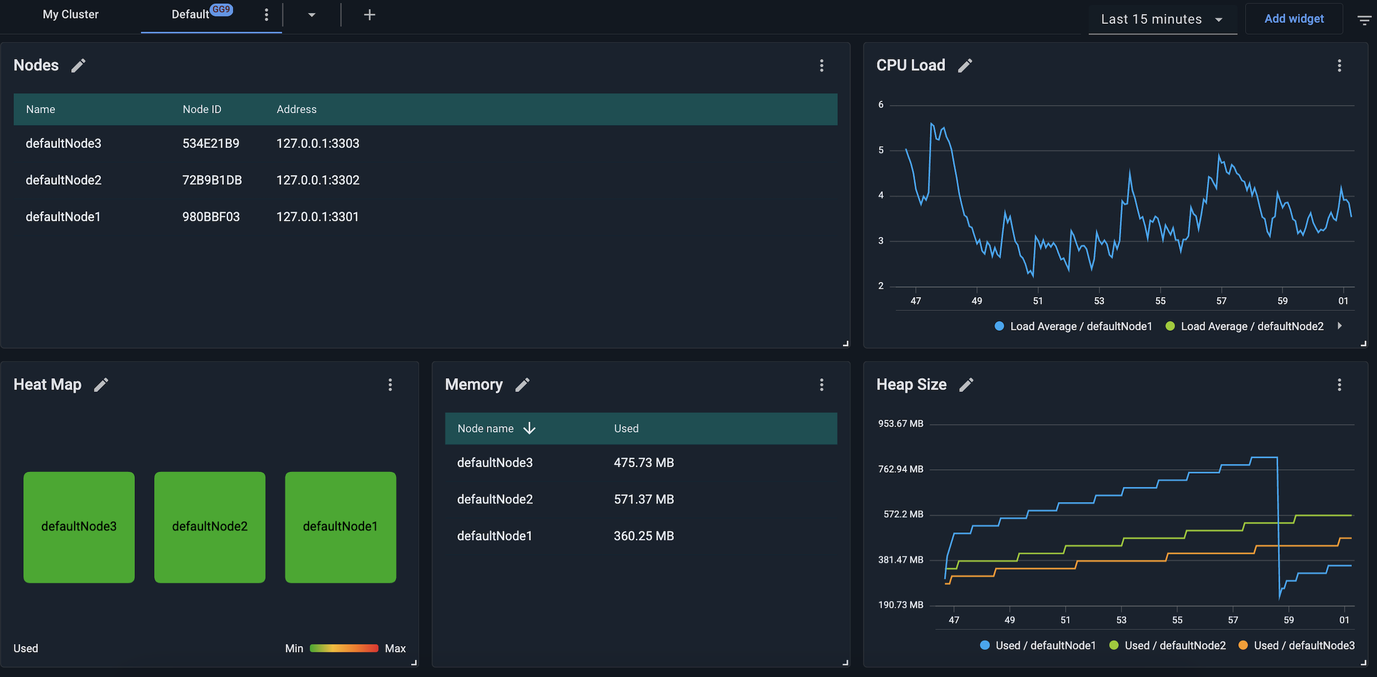
The Default tab includes the following elements:
-
Tab bar — for arranging widgets into tabs. Initially, there are two tabs - "My Cluster" and "Default". You can add tabs and reorganize the size and location of any widget.
-
Time period control — for selecting the time period for charts.
-
Add widget button — for adding a widget.
Adding Tabs
To add a tab, click the ➕ icon located in the tab bar and select to create an empty dashboard, create a dashboard based on a template, or import a dashboard.
The ⋮ menu of each tab enables you to rename, clone, or remove the tab.
Dashboard Templates
Dashboard templates are a quick way to create a dashboard with predefined widgets. For GridGain 9 clusters, Nebula provides the following templates:
-
Default: The default dashboard for monitoring cluster status. Has the following widgets:
Nodes,Heat Map,Memory,Cpu Load,Heap Size widgets. -
Empty: This dashboard is an empty container where you can add a custom combination of widgets.
You can save your current dashboard as a template by clicking ⋮ and selecting Save as Template. In the subsequent dialog, specify the template name.
Exporting and Importing Dashboards
You can export the current dashboard’s definition (including widgets, layout, etc.) as a JSON file. You can then import this JSON file into another environment and have the dashboard whose definition it contains added to your UI, with no need for additional configurations.
Exporting
To export the current dashboard’s definition as a JSON file, in the current dashboard’s tab, select Export dashboard form the context menu.
The file named Dashboard - <Dashboard_Name>.json is saved to your local Downloads folder.
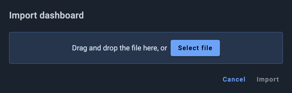
Importing
To import a dashboard definition from the previously exported JSON file:
-
Click the + icon ou your Dashboard toolbar.
-
From the menu that opens, select Import.
The Import dashboard dialog opens.
-
Drag and drop, or browse for, the required file.
-
Click Import.
The selected file is imported. The dashboard it defines is shown as the current dashboard in your UI.
Changing the Time Period For Charts
The tab bar contains the Time Period control. When you click this control, a date/time picker opens.

The picker enables you to select a time period for all widgets in the current tab (dashboard):
-
Relative to the current date/time
-
Absolute (custom) - unrelated to the current date/time
Relative to the Current Time
To select a period relative to the current date/time:
-
In the left-hand section of the picker, select the required option; e.g.,
Last 1 hour,Last 2 days, etc. -
Click Apply.
Absolute (Custom)
To define a period in absolute terms:

-
In the left-hand section of the picker, select the
Customoption. -
In the right-hand (calendar) section of the picker, select the first and last dates of the period.
-
Click Apply.
Interactive Zooming for Charts
To interactively zoom into the details of a chart:
-
Click your mouse within the chart at the "start" moment of the period you want to zoom into.
-
Drag the cursor to the "end" moment of the period you want to zoom into.
All charts on the current dashboard are redrawn to show only the period you have defined (rather than the default period or the one specified previously with the time picker - see [Changing the Time Period for Charts]). The chart scale automatically adjusts to the chart segment in the selected zoom.
-
Repeat steps (1) and (2) as needed.
-
To return to the initial zoom and scale, click the Zoom out button in the right-hand part of the dashboard toolbar.
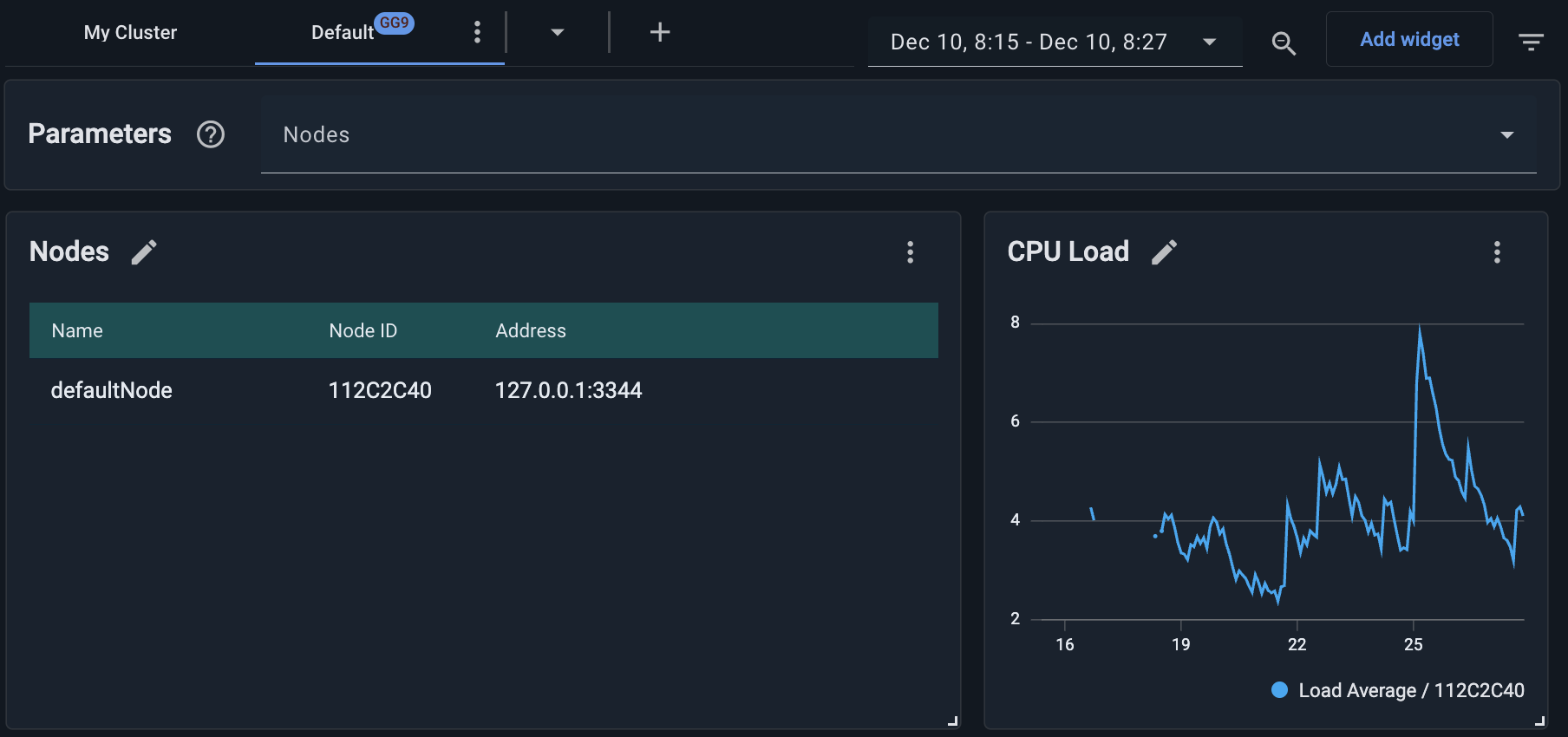
Node-based Filtering for Widgets
You can use the dashboard parameters to limit the widget scope to specific node(s).
Each widget collects metrics according to its configuration. This does not change when you apply node filtering. What does change is what the widget shows in the UI. For example, if a widget is configured to collect the CacheSize metric for all nodes in the cluster, and the selected parameter filters the widget to node A, the widget will keep collecting CacheSize for all nodes, but it will display the data only for node A.
To define the widget node filtering:
-
Click the icon to the right of the Add widget button to toggle on the Parameters panel.
The panel displays across the top of the dashboard.
-
From the Nodes drop-down list, select one or more nodes.
-
Optionally, to undo all selections, click Clear.
The node filtering applies to all widgets on the dashboard.
Next Steps
© 2025 GridGain Systems, Inc. All Rights Reserved. Privacy Policy | Legal Notices. GridGain® is a registered trademark of GridGain Systems, Inc.
Apache, Apache Ignite, the Apache feather and the Apache Ignite logo are either registered trademarks or trademarks of The Apache Software Foundation.