Metrics in Distributed Systems Monitoring
Metrics change over time and, at any particular time, indicate the current state of a system. For example, you can determine whether everything is good with your computer by checking the processor load level, the amount of memory, and the used disk space. Also, for example, a graph that identifies numbers of business operations describes the system from a particular angle and helps you understand whether the system is doing what is expected of it. You can use metrics to answer questions about monitoring in general and distributed systems in particular, provided that the correct metrics are used. However, it is not always clear what metric should be used or how or when a particular metric should be used. The use of multiple metrics can produce a multitude of data, which can be interpreted in multiple ways. So, sometimes, the use of metrics increases the complexity of a task.
Various applications make it easier for users to work with metrics. In addition, most monitoring software includes components, such as GridGain Control Center, that work with metrics. Control Center is a highly specialized, comprehensive, customizable tool that developers use to manage Apache Ignite or GridGain distributed database clusters. As you know, management includes observation, measurement, and analysis of effectiveness. In Control Center, management is performed via metrics. Control Center, a relatively new product, works with a wide range of metrics. Control Center’s two predecessors, Web Console and Visor, could not work with such a wide range of metrics.
In this article, I talk about the evolution of the metric-selection component that is used in GridGain Control Center and about the changes that the component has undergone in appearance and, to a greater extent, in logic—from the time that I joined the company to the present time. The processes that I describe are inseparable from the principles of Agile development and are an illustration of the idea that "any interface component undergoes a series of changes, as a result of which the component either becomes more user-friendly or is abandoned."
How It All Began
When I joined the team that was working on the GridGain Control Center applicatIon, many of the sections and components had already been implemented. Because the product interface was created by front-end developers, I had a number of questions. My questions related to the use of primary and secondary colors, font styles, and icons; the appearance of components; the lack of screens with starter content and empty states; and the consistency of the application’s style.
My questions highlight the importance of the designer role, as the designer engages in the integral process of designing and developing an interface that is not only aesthetically attractive but also easy to use. In all projects, interface designers are advocates for the user, defending the user’s interests not only in terms of visual design but also in areas such as interactive design, information architecture, human-computer interaction, usability, and discoverability of and ease of working with elements. A good interface designer empathizes with and represents users.
For example, one of the negative aspects of the interface was the metric-selection component. The component that is presented in the following screenshot was in the widget menu and in the notification configurations dialog box.
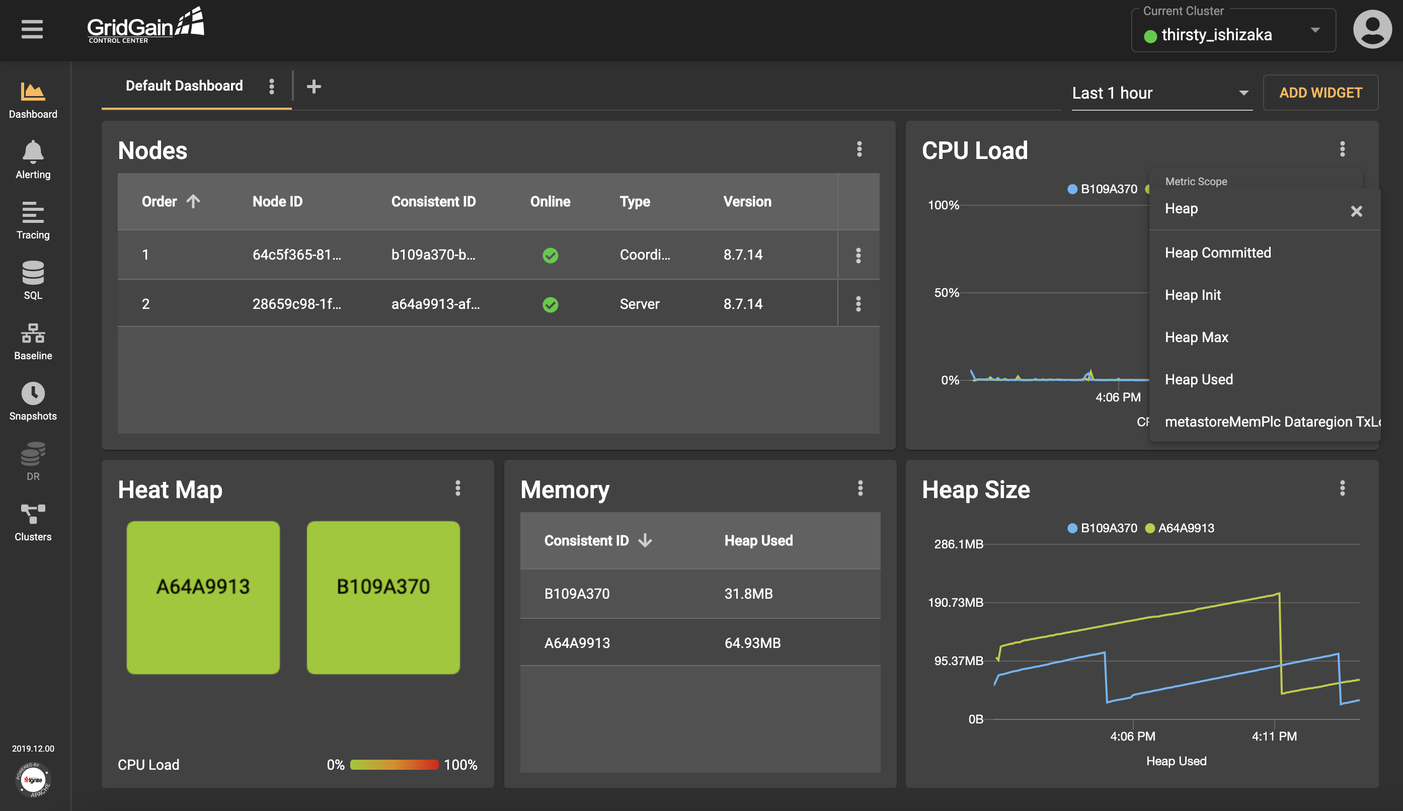
The component was a drop-down list that included a field for entering search queries. Surely, this option, although not the best, was one of the fastest and easiest options to implement. After all, it worked, and it could be improved later. However, its biggest drawback was that the drop-down list included all existing metrics, and users had to know the exact name of the metric that they wanted to use. Also, the ability to investigate the available options was limited. In addition, the drop-down list often loaded so slowly that spaces were created between elements. So, working with the component was one continuous pain. Something needed to be done!
Bibbidi-Bobbidi-Boo, the Drop-Down List Turns into...
To solve the metric-selection component’s problem, it was necessary to ask and answer several questions:
- Is the format of the metric-selection component convenient?
- What difficulties, in addition to slow loading and the issue about locating the desired metric, do users encounter?
- Can the metrics be grouped?
- As users choose metrics, what visual feedback is useful to them?
After the questions were answered, actions were taken.
- First, a different format was chosen. The simplest, and most elegant, solution was the placement of a drop-down list that included a search-query field into a separate dialog box. This solution solved the slow-load problem and provided flexibility.
- Second, the metric names were truncated (without tooltips that display full names). In this case, the dialog box worked well, because it accommodated a wide table and all the names fit within the table.
- Third, to optimize the search for metrics, metrics need to be grouped. The grouping can be based on any characteristic that is inherent to the metrics. For example, scopes group metrics into three types: cluster, node, and cache.
- Fourth, to provide visual feedback, the names of the metrics that users selected were displayed on chips. The chips were placed in a separate block, enabling users to undo their selections.
Time and human resources were limited. And, it was necessary to design and implement a user-friendly solution relatively quickly. It was not necessary to act on all the insights that were gained from the team discussions. It was enough to implement the first acceptable version, a version that could be improved in the future.
Thus, the dialog box that is presented in the following screenshot was created.
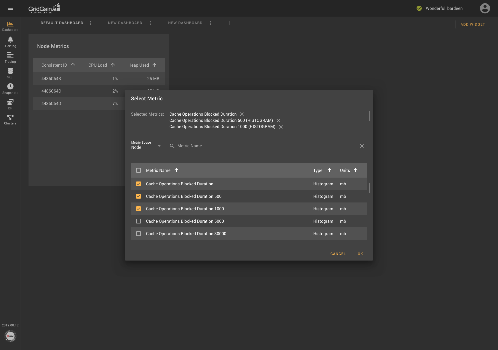
The dialog box contains chips, a drop-down list for selecting scopes, a field for searching for metrics by name, a table with radio buttons (in some cases, with checkboxes), and several columns of data. The result was acceptable, but it was necessary to continue to improve usability.
Rejection of Scopes in Favor of ...
A few months later, features were added, and the requirements for the metric-selection component were changed. It was time to ask new questions:
- Are the scopes consistent with how the clusters work?
- How can the mechanism for selecting metrics for similar entities be simplified?
- Are the blocks in the new metric-selection component (presented in the dialog-box format) conveniently located?
- Where can users find the help information that they need to use the component?
And, again, the answers were found. One part of the solution was to group metrics according to the principles that are used in the GridGain catalog. For example, consider the following metric names:
io.dataregion.default.AllocationRate
io.dataregion.default.PagesFillFactor
io.dataregion.default.OffHeapSize… (and so on).
The names share some of the same parts. To make it easier for users to work with the names, the names were presented in a tree structure, with each level of the structure separated from the previous level by a dot. A root folder was placed at the top level. An “io” folder was placed in the root folder, a “dataregion” folder was placed in the “io” folder, and a “default” folder was placed in the “dataregion” folder. A list of metrics was placed in the “default” folder. The use of tree-structure grouping also solved the long-name problem.
At the same time, the problem with scopes, which are abstractions that are used in GridGain Control Center, was solved. In a cluster, there are no scopes, so the designation of metrics as cluster, node, or cache raised concerns about usability. In particular, it was not clear why users were not given the option to add scopes (for example, data regions). In practice, this limitation was a problem because the set of scopes was hardcoded into the backend code and the users could not change the set. Clearly, the existing mechanism for selecting metrics needed to be changed, so that users could work with all metrics in the same way.
So, the idea of replacing scopes with metric-name templates was considered. Users could customize templates at their discretion, putting an asterisk in the right place and thereby selecting similar entities. So, for example, instead of including the CacheGets metric in the cache scope, the "cache. *. CacheGets" template could be used. And, for viewing the sizes of various date regions, the "io.dataregion. *. TotalAllocatedSize" template could be used. Consideration of such examples prompted the decision to replace scopes with templates. The use of templates not only enabled users to solve problems but also provided the possibility of more flexible customization.
It was also decided to move the block of chips that display the selected metrics’ names to the bottom of the dialog box. This placement is more logical because users can make and then cancel choices, but they can’t cancel a choice that they haven’t made. It was noticed that the existing metric-selection dialog box did not have a reference section. It was decided to add a reference section, marked as an icon with a question mark (a pattern that is familiar to most users). And, the metrics’ names were given accompanying descriptions to make it easier for users to choose the desired metric.
Through these decisions and innovations, the component was improved. The result of this work is presented in the following screenshots.
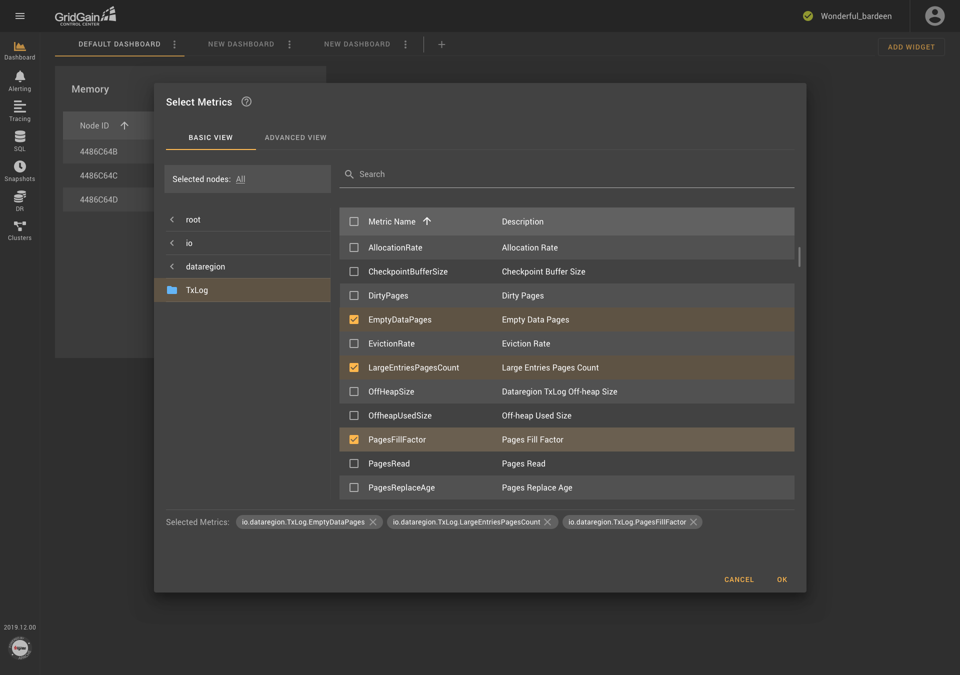
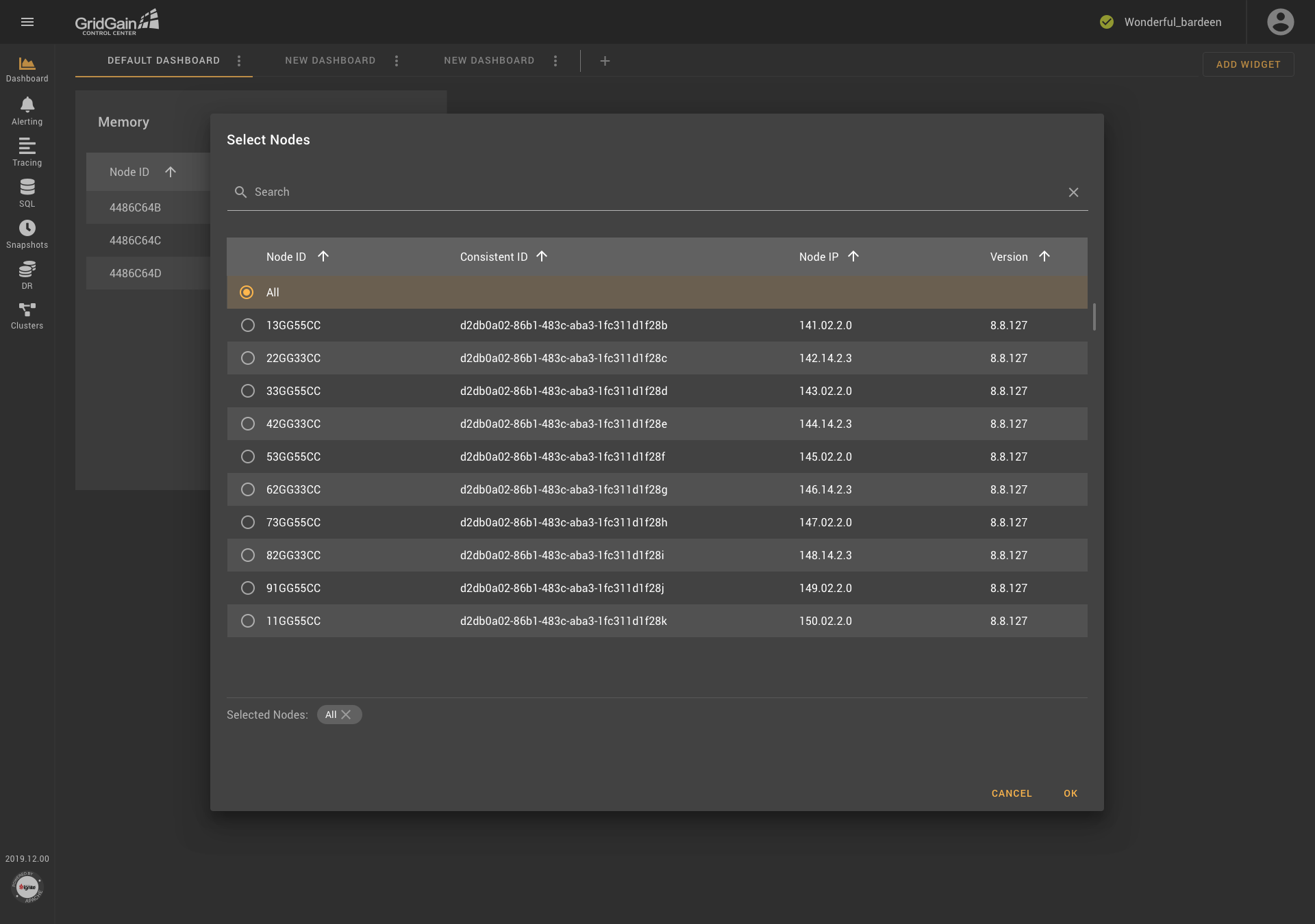
As you see in the first screenshot, the dialog box contains two tabs: Basic View and Advanced View. In Basic View, metrics are grouped into folders, which are organized according to the tree-structure principle. Descriptions are provided for each metric. In addition, users can select nodes if needed (as shown in the second screenshot). Metrics are searched in all existing groups.. The block that contains the selected metrics is located at the bottom of the dialog box, and an icon that provides access to reference information is displayed next to the name of the block.
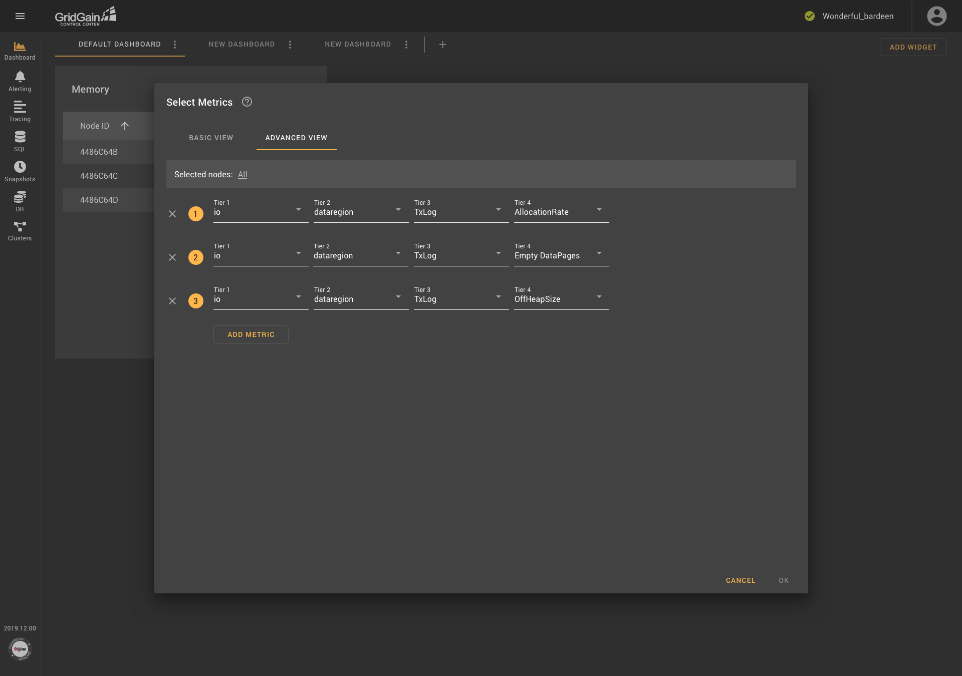
The Advanced View tab contains a block from which a node if needed can be selected, an icon for accessing help information, and templates that are composed of drop-down lists. Templates can be added and removed. Thus, all the weaknesses of the previous version of the metric-selection component were addressed, and users received a convenient tool with flexible settings.
Everything Is Broken ... or Not?
The addition of templates and the ability to work with multiple metrics affected other parts of the application. In particular, it was decided that graphs would show an unlimited number of metrics, including metrics with different units of measurement. This decision significantly changed the logic on which the operation of the graphs was based. I offered several solutions to this problem, and, after discussion with the team, I identified a compromise solution, as presented in the screenshot.
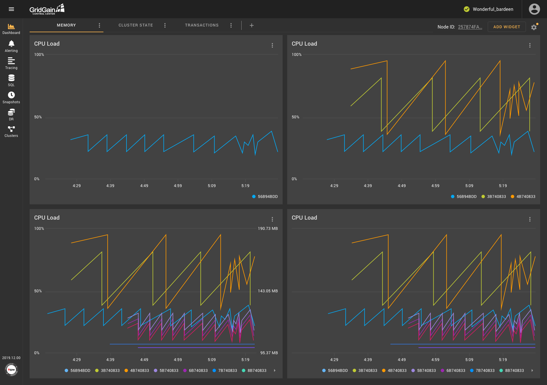
When metrics with the same units are shown on a graph, one ordinate axis is shown to users.If the units are the same, but the scales of the values are significantly different, an additional axis is shown on the graph. Also, an additional axis is shown when metrics use two different units of measurement. However, If the metrics use more than two different units, no additional axes are shown—to save space. Moreover, in all these cases, the information that the user needs can be obtained from the tooltip that appears when the user hovers over the chart.
It became obvious that other widgets and sections of the application required rethinking. For example, the notification configurations dialog box would benefit from modification because users might need to configure a notification that consisted of multiple conditions that used multiple metrics.
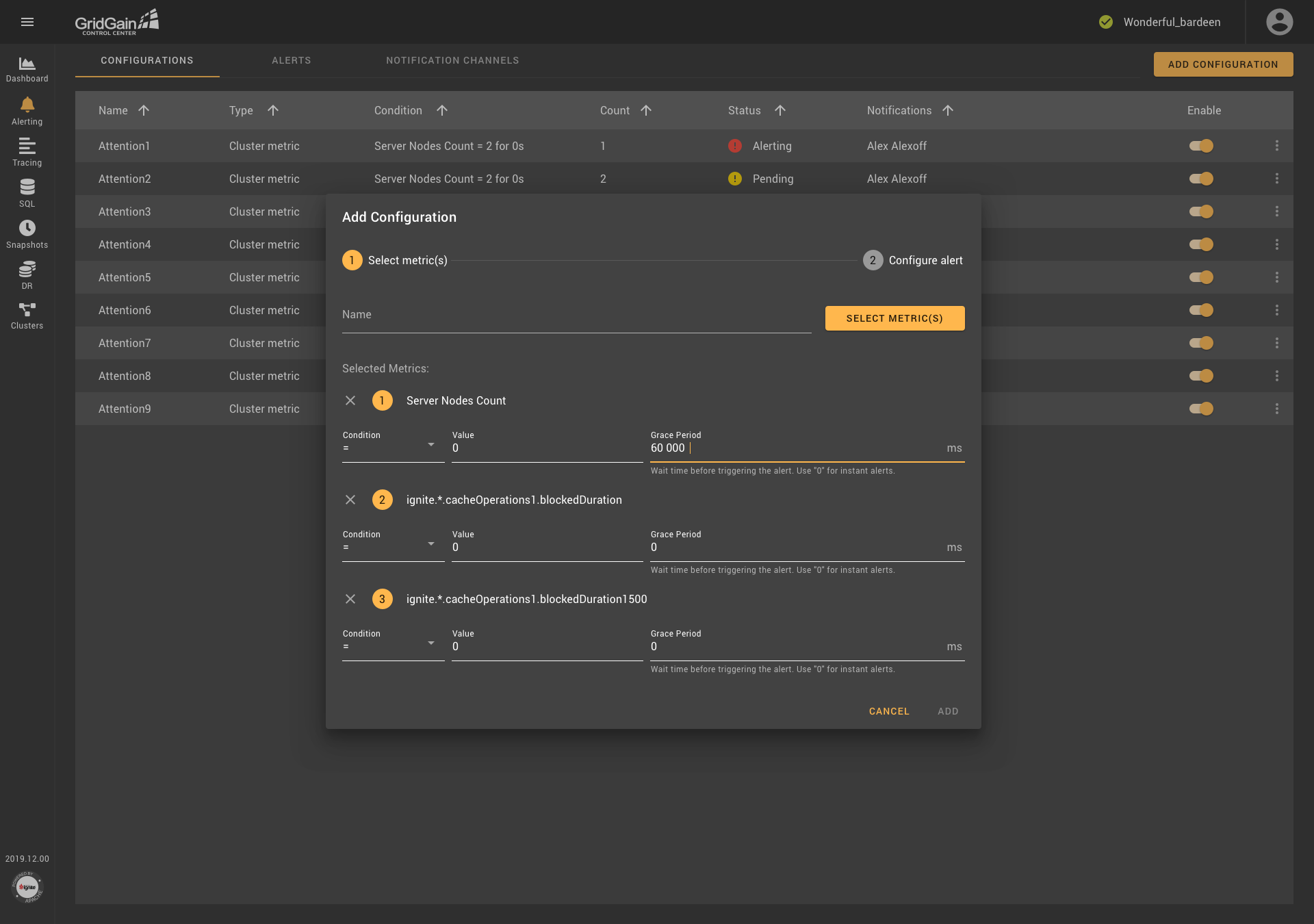
Thus, the transformation of one component can affect many parts of the application. So, when a component is redesigned, all possibilities and ramifications must be considered.
Conclusion
Over a period of one and a half years, the metric-selection component changed three times. The reader might ask, "Why couldn't it have been done right away as it was done in the final version?" The answer is that applications are continually evolving, in response to external factors (for example, changing requirements and user feedback) and in response to internal factors (for example, a change in one component or one element of a component that affects a change in another component or element). Therefore, every component of an application and every application, once it exists, becomes better (as did the metric-selection component) or is abandoned.
